One of the great things that sets apart the Pickleballist Community from other social medial platforms is Organization. In fact, there are 5 things that really differentiate these forms and you can read more about OPERA over here.
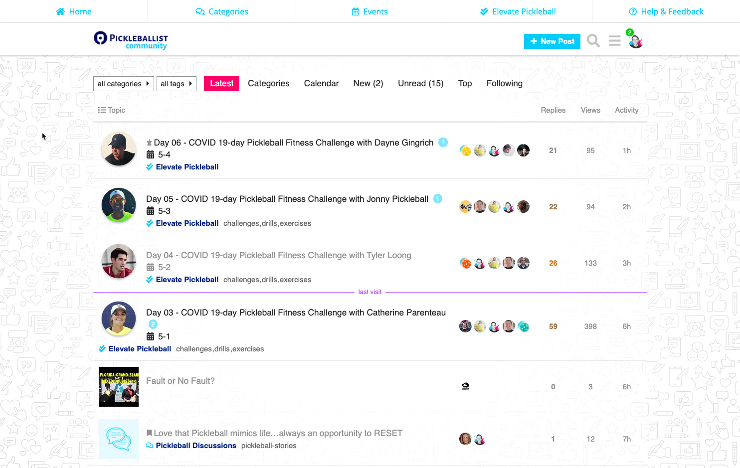
I don’t think it’s super clear, right now, that there are different “categories” which act as different forums (similar to how Reddit has “sub-redits”). We can also have additional sub-categories within a main category.
Hey pickleFAM!
I’ve talked with a few community members about this, on the side, but we do have to be careful about making our briches too big for our body. As we grow, we can continue to modify the forum categories and sub-categories, but for now, the best rule of thumb is… let’s try to have as few as possible… until we hit a wall, which requires expansion, in order to offer more CLARITY to community members.
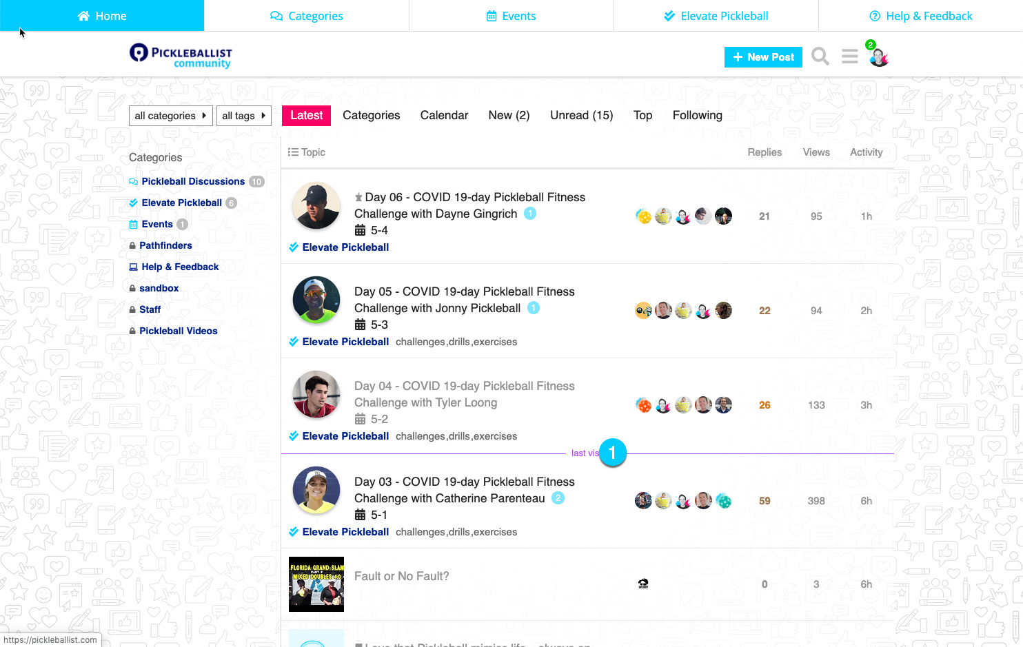
So I’ve been tinkering with adding a new feature (which would only be visible on desktop - not mobile) which I think would create a better UX and provide a visual depiction of the existing community topic compartments (categories).
I think the new design definitely make it more clear that there are different categories. Are we running into an over redundancy issue with having 1) tabs with categories across the top 2) drop down menu with categories above categories 3) new design column with categories listed. Maybe it is good thing to have so many options? I really can’t say until I use it, but I like the looks of it.
I dig the new design! I’ll admit, it took me a little while to get the hang of the current layout. To me, it seems like the new design would be much easier for people to get used to quicker.
Thanks for the feedback, y’all! This is so helpful This is your community… thanks for rolling up your sleeves and helping to shape it!!
Great consideration. From a UX standpoint, I would def get dinged a bit
Ultimately, those top nav buttons will link to other tools/resources that Pickleballist provides but since right now the focus is on the forums, I wanted to make it super quick and easy to see all categories, see upcoming live events, get help/offer feedback, and also Elevate for daily check-ins. Elevate may be one of the most important links up there b/c I’d like to see that forum to continue to act like it is right now for the 19-day challenge… that anyone can go there at any time to share a personal goal or group challenge, and be able to check in daily and be accountable to their pickleFAM!
I wish I had stats to see how many clicks I’m getting on that dropdown menu. My gut says that people don’t know intuitively that the drop-down can change CAT’s. You and i knew it but I’m guessing the majority may not… esp on desktop b/c it’s so subtle.
Yo @Webby thanks for the candor. That’s what we need!! I was having a hunch that it may be difficult for some. They might be fine… not knowing what they don’t know… but the problem with that is… I WANT THEM TO KNOW that there are categories and the beginnings of some great organization of content.